Frontier Mobile App
User Problem
Frontier customers relied on multiple touch-points to manage service like internet, TV, phone, billing, and device troubleshooting.
They needed a single, intuitive mobile interface that allowed them to:
- Pay bills and manage autopay with minimal steps
- Monitor and troubleshoot home Wi-Fi and connected devices
- Access and upgrade streaming and TV subscriptions
- Give customers credibility that their solution was high-tech
Strategy
My Role
I was a UX/UI designer and UX strategist. I would create screens, write decks, write annotations, and contribute to the Frontier design system. All using Figma.
My Contribution
I drove research conclusions in the audit and IA phase that pushed towards heavy support and tracking features.
Research
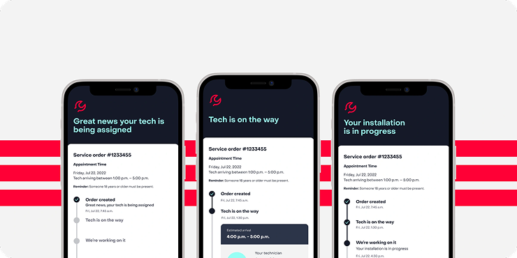
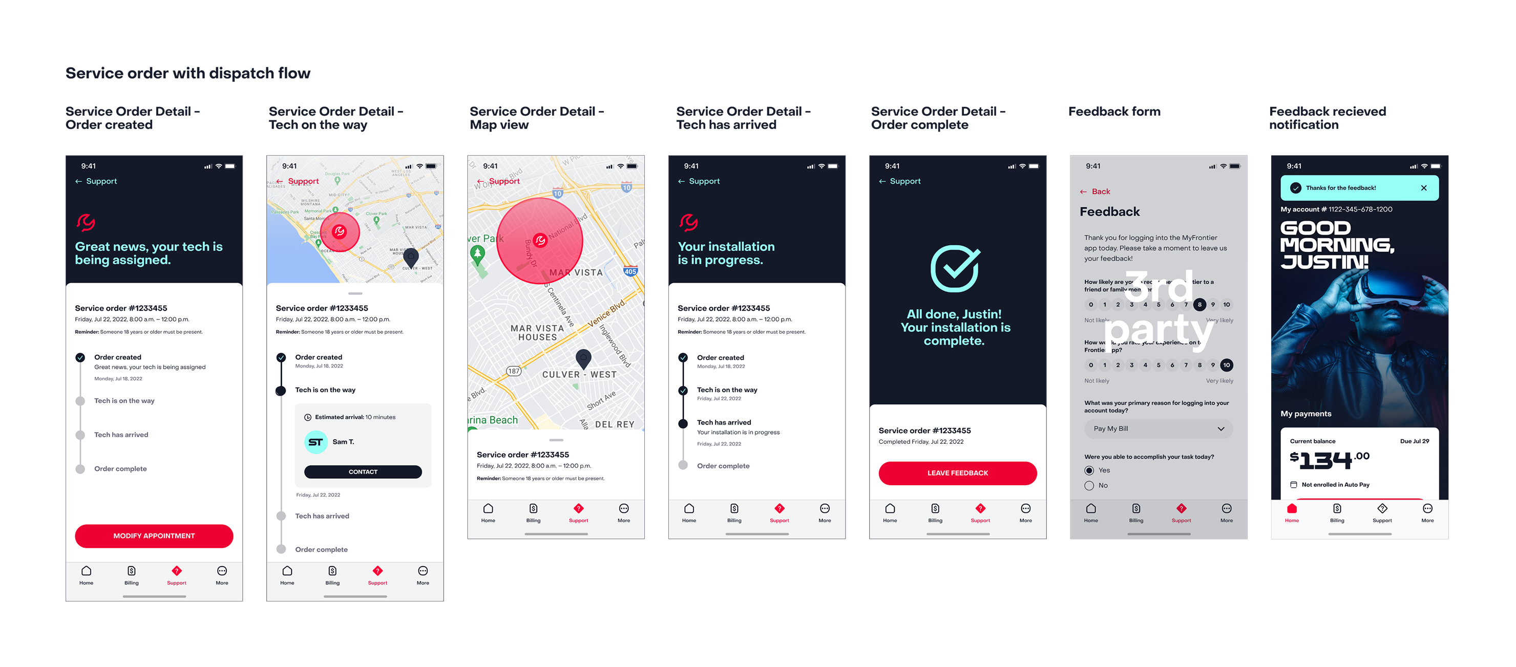
We researched by auditing the existing frontier app and pointing out any existing issues. Support was by far the most confusing part of the app, with network errors rendering in code. I made specific note of this and drove for more support scope.
Mapping
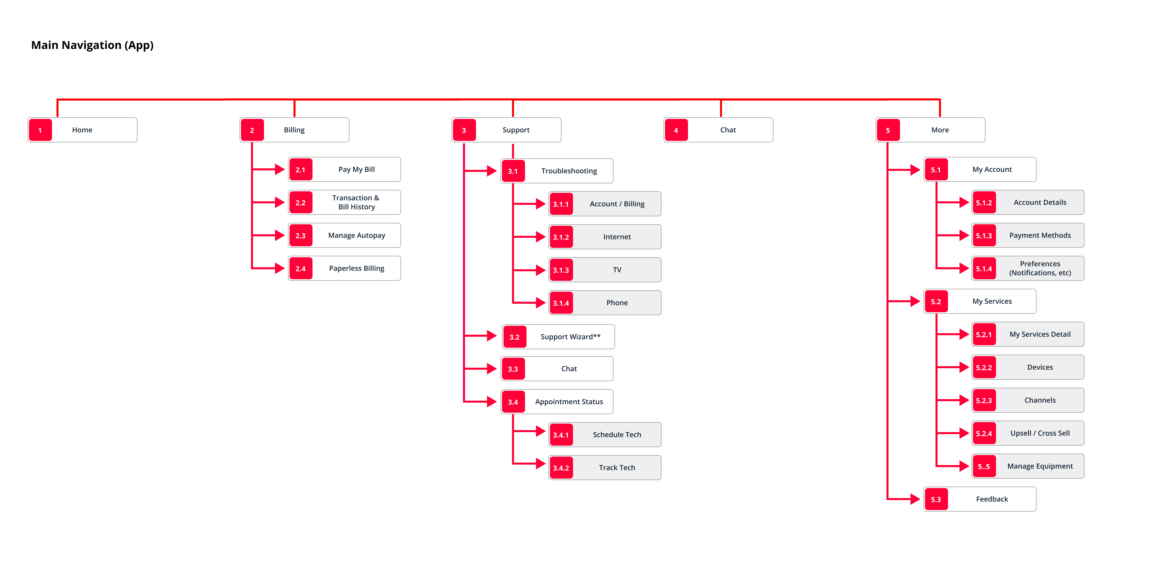
Based on the first audit and business recommendations we built a map for all pages in the app.
Solution
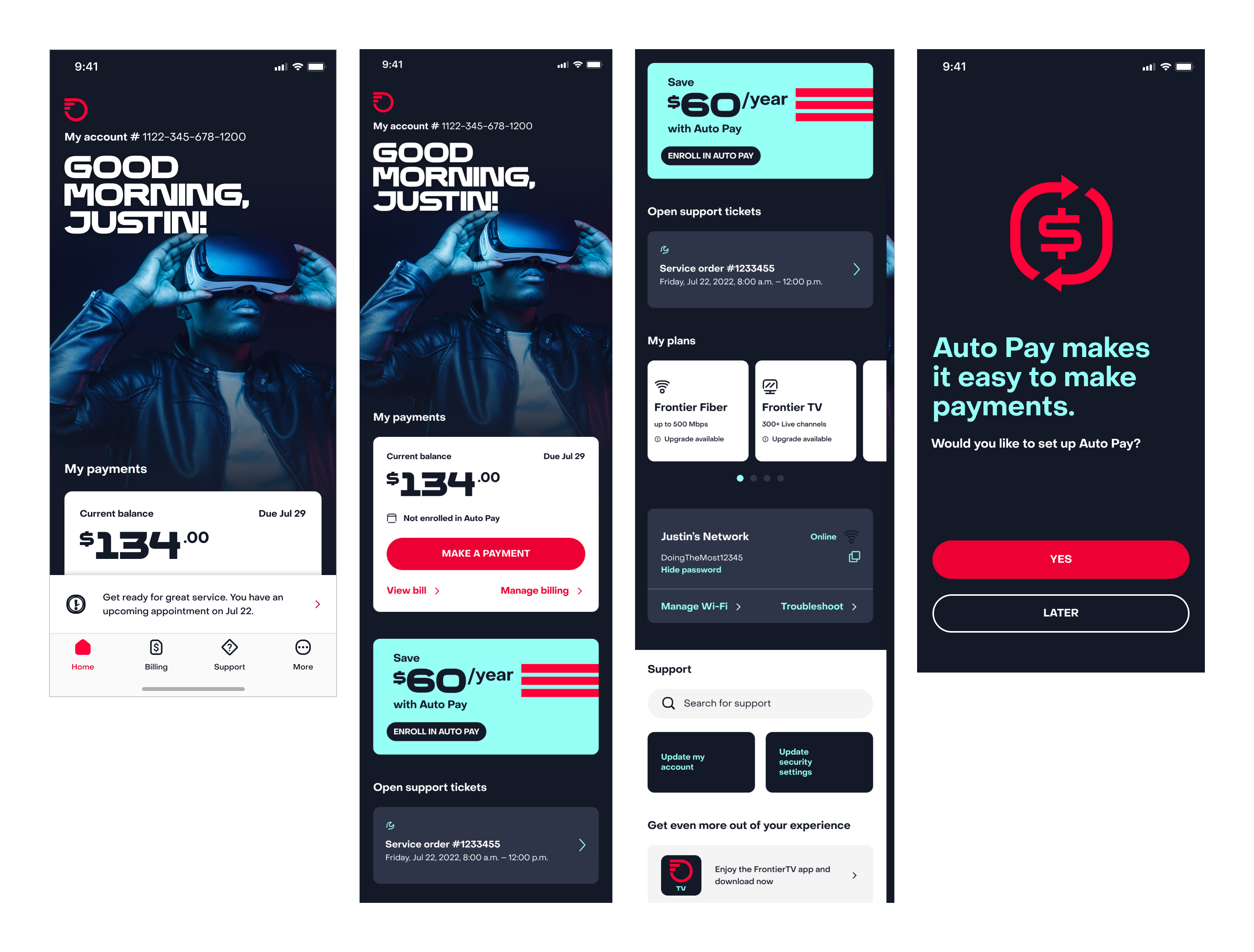
The redesigned app prioritized billing and support features based on user research findings. We created a comprehensive mobile experience that balanced Frontier's desire to showcase their technology capabilities with users' primary needs for billing transparency and reliable support.
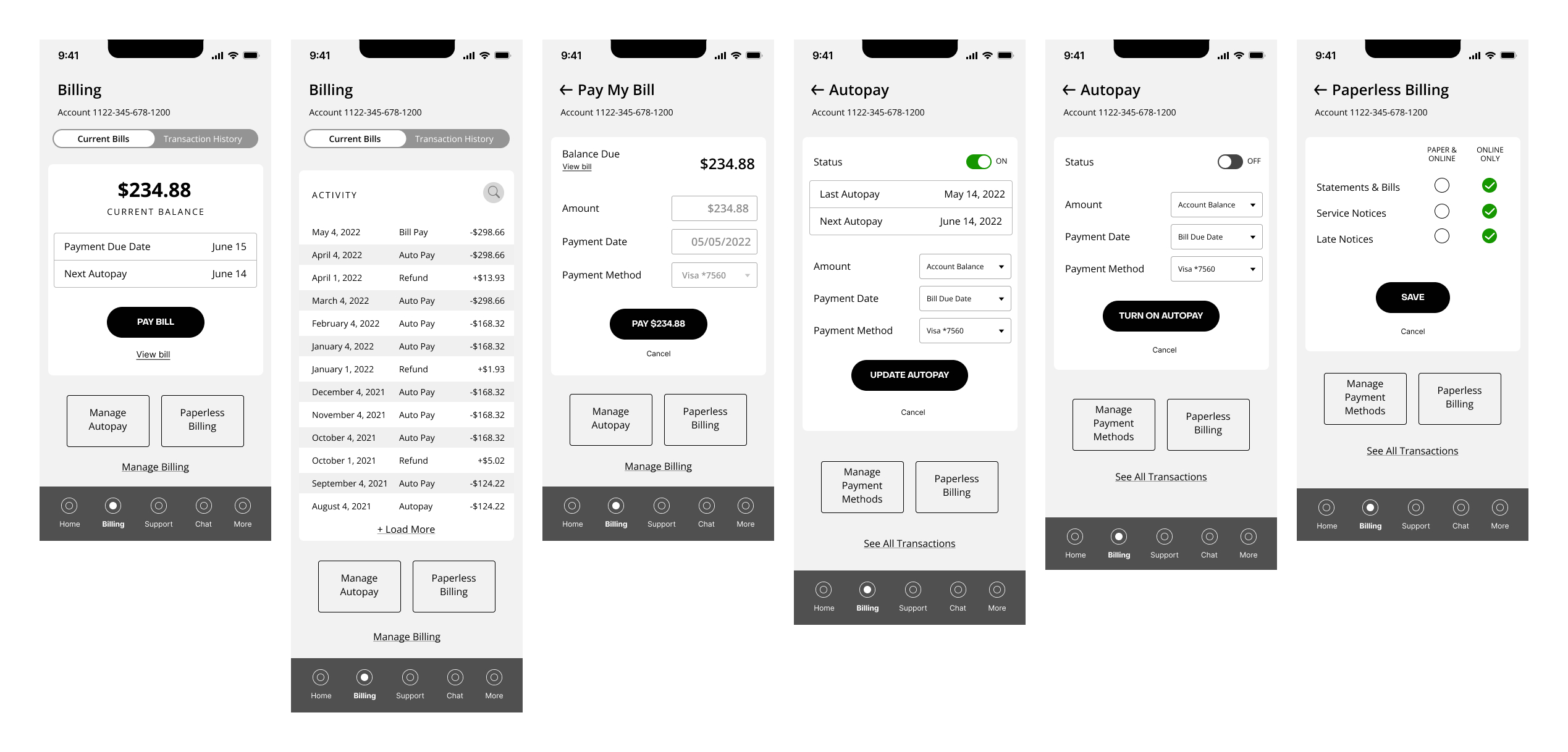
Key solution elements included streamlined billing workflows, enhanced support tracking features, and a cohesive design system that made the app feel modern and trustworthy.
Design
Design System
These workflows became part of a billing prototyping design system that was internal to Razorfish. I contributed the flows as derived from two projects, Frontier and Bread Financial.
UX/UI Feature Pitch
The most high-value features in the app were by far the opportunities for more robust support tracking. These features represented a UX/UI hybrid engagement where I put together high-fidelity wires to pitch the functionality.
Results
The redesigned Frontier app achieved significant improvements in user satisfaction and market performance, with lasting impact on the user experience.
Impact
Widespread Adoption: Frontier's app is widely downloaded and used and retains the same UI/UX design system we created.
Sustained Improvement: The app store rating improved from 3.5 to 4.6 year over year, demonstrating significant user satisfaction gains.
Long-term Success: The design system and user experience patterns we established continue to be used by Frontier, showing the durability and effectiveness of our design approach.
Insights
Utmost Empathy for Users
One of the most challenging user mindsets is that of the disgruntled ISP customer. Having a rigorous design system that makes shipping features fast is key, as is simplifying and clarifying as much as possible. Avoiding patronizing UX/UI, or overly prescriptive or condescending UX patterns was crucial for user acceptance.
Users Over Dashboards
Frontier wanted to showcase their incredibly fast speeds, but users wanted to see billing and support transparency. Injecting optimism about new technology through dark mode branding and sleek UX makes balancing both needs possible without disrupting UX.
Research-Driven Feature Prioritization
The audit phase revealed that support features were the most problematic area, with technical errors appearing as code to users. This research insight drove the strategic decision to heavily invest in support and tracking capabilities, which became the app's most valuable features.