Rudderstack UI
Product designer on a small team for a developer-first data product
User Problem
Rudderstack's front-end, like many data products, was constantly in the throes of an existential crisis.
- UI not emphasized An engineering-focused company in every way, our UI was treated as a second glance for error visibility and demos only, internally, which flowed our reputation out to our customers as "go to the UI second"
- Sophistication didn't match up Our product was highly sophisticated, which wasn't represented in our UI
- CredibilityWe had to move Rudderstack forward in terms of our styling and UX to drive credibility vs competitors
- Friendliness We had to convey friendliness at every opportunity because our product is intimidating

Strategy
- Meet everyday Our remote team started meeting for 2-3 hours every day to critique any and all UI to maintain consistency
- Components only My two brilliant colleagues on my small but mighty team of 3 had incredible focus and process on component discipline and design system grooming and it made me a better designer, and our product better.
- Educate Design was extremely foreign to most of the brilliant people in the company and they were hungry to understand as much as possible.
- Design System Contributions were made by committee with my talented colleague Eddie tracking all updates
My Role & Contribution
I was a product designer on a team of 3. I worked most closely with a PM and EM to define workflows in early stages of component design, and then with my two design colleagues in later stages for critiques, brainstorming, and design-system implementation.
Solutions
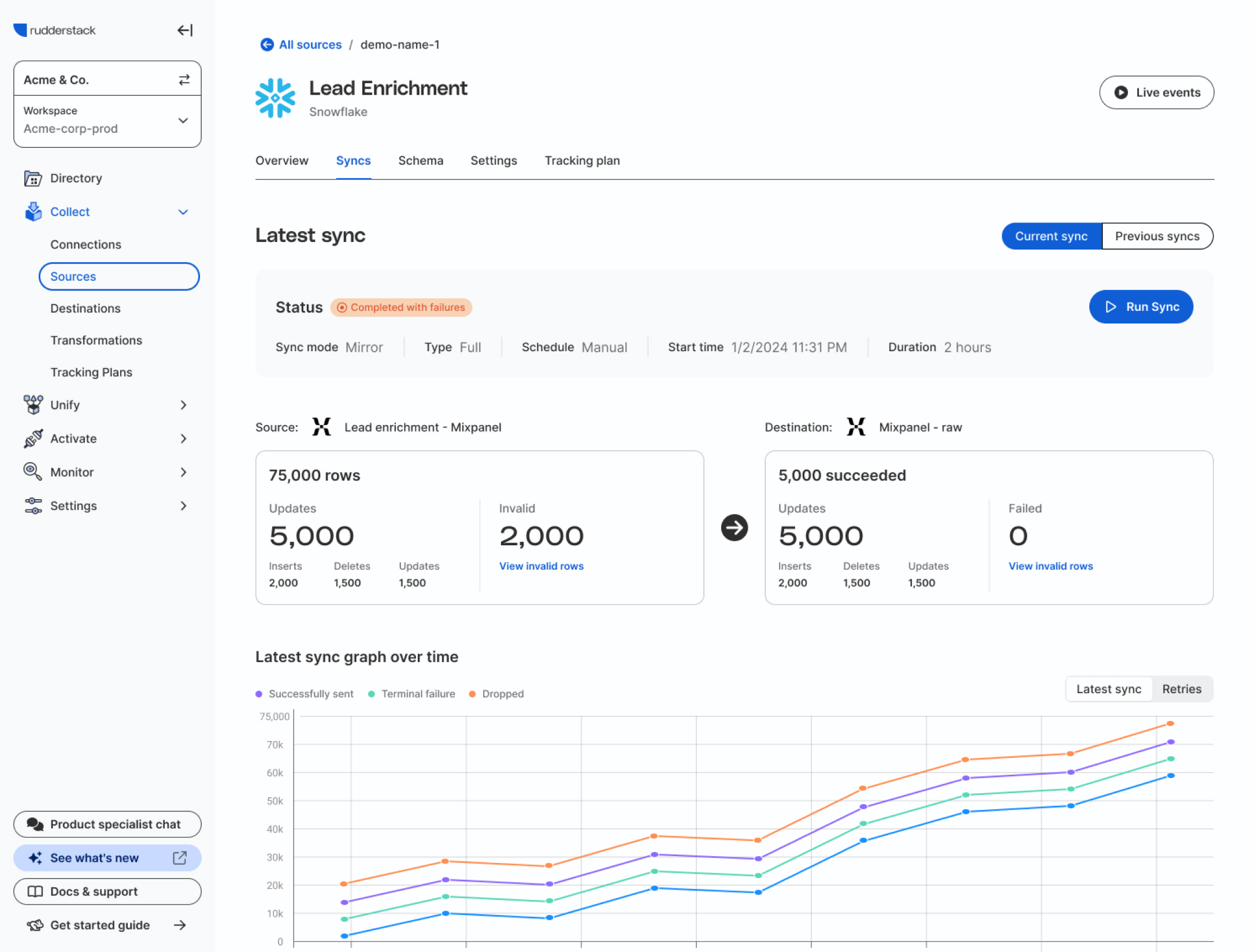
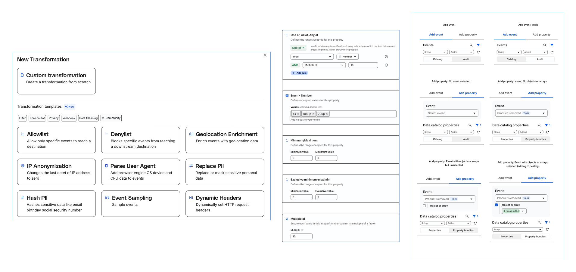
- Transitioned from static, form and table-driven layouts to a dynamic, Notion-like interface with flexible page structures, drag-and-drop modules, and collapsible sections.
- Button-driven interaction model We replaced buried links and settings menus with discoverable, action-oriented buttons; introduced tooltips, hover states, and micro-animations to reduce friction.
- Rich, in-context functionality allowed key actions (e.g., enabling/disabling sources, editing transformations, viewing real-time event logs) directly from list views and dashboards, minimizing page reloads.
- UI patterns that flexed As functionality got built in the cutting edge for CLI customers, we kept an eye on the pipeline for functionality that might surface to the UI, and built our design system extensibly.
Insights
More users
Introducing UI-first functionality like tracking plans and health dashboard broadened our userbase with our customers to bring marketers and other non-technical users truly into the fold
Higher design system adoption
Advocating for design by working with engineers at each step of the process increased design system adoption and improved development speed.